Hi, this week has been a bumper week of goodness at Paperartsy and we were surprised and wowed when my good friend Sam appeared on Wednesday with an Oriental-themed tag
here and delighted again on Friday when Lin Brown made a washi-tape background hanging piece
here
I knew I wouldn't have time to do both (having been very lazy all week!) so have combined elements of both into a journal page.

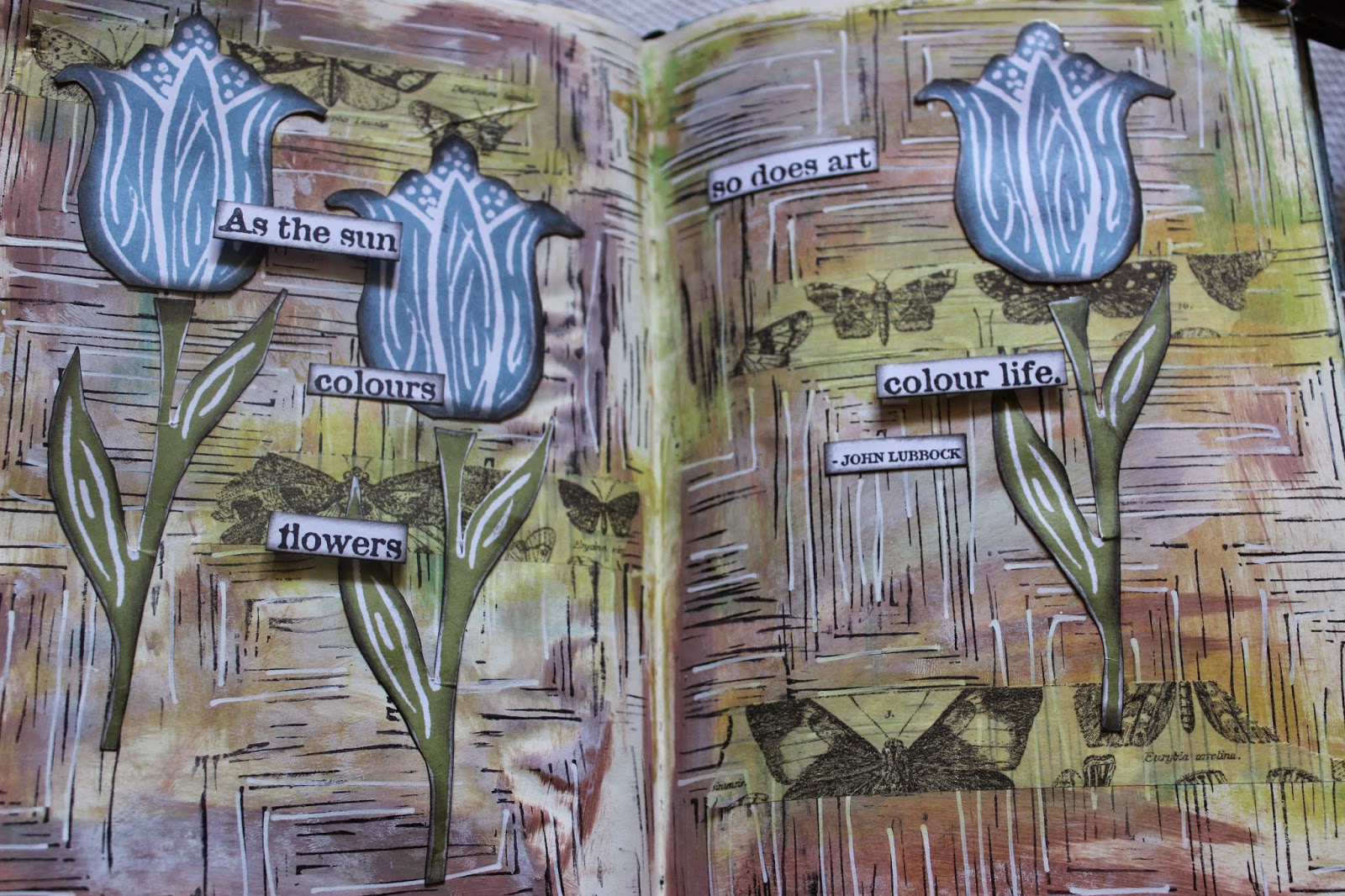
As ever, my background is leftover paints from previous projects, this was the Lin Brown limited edition Fresco's so very apt for the new challenge... I stamped the scratchy rectangle stamp in black over the whole page, and added white Sharpie pen highlights, as in Sam's background.
From here I went with the Lin "mash up" and the tulip idea - I don't have the same stamp plate Lin used, but in hindsight I think this is for the best, as it would have been too busy on my background. I stamped and cut out several tulips and stems from ELB03. using Cornflower Blue archival ink, which is reflected in part of the background
I only ended up using 3 in the end, but first I added some of Tim's tissue tape and blended it into the background with some watered down Chartreuse Fresco. (this also seals it to the page a little, as I've almost run out of matte medium)
I stamped one of the sayings from ELB05 and cut the words out separately and edged in Black Soot, which I also used for the flowers. After I'd finished, I remembered Lin's trick of using a small dabber for this which would have been much easier!
I used 3d mounts for some of the words, and stuck some straight to the page, so there was some difference in relief.
I really had fun with this, so thanks to Sam and Lin, for the inspiration!
Entering the Paperartsy challenge,
here
 As ever, my background is leftover paints from previous projects, this was the Lin Brown limited edition Fresco's so very apt for the new challenge... I stamped the scratchy rectangle stamp in black over the whole page, and added white Sharpie pen highlights, as in Sam's background.


Oh wow Helen that works so well. Loving your background with those colours and your LB style flowers fit perfectly.
ReplyDeleteThanks for taking inspiration and playing along, good luck in the draw later today.
Sam xxx
I really love it a lot Helen. The background colours are so earthy, it reminds me of an old allotment shed. The tulips sit comfortably onto it and it has a lovely "at home" feel. Xx
ReplyDeleteOo I like!! :-)
ReplyDeleteHelen this is glorious! The colours are super and those blue tulips work perfectly against the gorgeous background. I think you are right that the others would have been a tad too much. I absolutely love this.
ReplyDeleteHugs
Lesley Xx
Great page - wish I could see it in real life I know it will be even nicer
ReplyDeleteLove the colours, they work really well. Jo xx
ReplyDeleteGreat mix Helen love how you have blended the two different style xx
ReplyDeletelovely pages helen!!
ReplyDeleteReally nice Helen, great composition and i love the combination of flat and raised words.
ReplyDeleteI love the colours and works very well. xx
ReplyDeleteYour background is great Helen..love those colours and the little row of butterflies..The tulips look fantastic!!
ReplyDeleteThis works really well, Helen, I love it!
ReplyDeleteLucy x
Really like that you have combined both projects, looks fab and loving the choice of colours.
ReplyDeleteWow, that's a fantastic page, the background looks great.
ReplyDeleteA wonderful page Helen...great words & beautiful tulips!
ReplyDeleteFabulous pages:-)
ReplyDeleteAbsolutely gorgeous pages!
ReplyDeleteGreat colours. Love this
ReplyDeleteI actually like this better than the one Lin made. It may be the colors, it may be the sentiment, but yours is AWESOME!!
ReplyDeleteGorgeous pages - such movement and drama in the background and the tulips are just lovely.
ReplyDeleteAlison xx